Design Principles | Final Compilation
05/02/2024 - 22/03/2024 | Week 6 - Week 7
Nadia Chong Wen / 0355736 / Bachelor's of Design (Honours) in Creative Media.
Final Compilation
LECTURE NOTES
All lecture notes are done in Task 1.
INSTRUCTIONS
Task 1
Task 1 - Exploration
Task 2
Task 2 - Visual Analysis
Task 3
Task 3
SUBMISSION
Task 1 - Exploration
09/02/2024 - 23/02/2024 | Week 1 - Week 3
Link to Task 1.
The reason why I chose Confluence as a design that has the same goal as the UNSDG goal of Life Below Water is due to the meaning that Courtney Mattison created this piece for. She created Confluence as a reminder of the damage that climate change and pollution can have on the coral reefs, paying homage to Indonesia's rich underwater ecosystem. Corals are extremely sensitive to the change in their environment, which causes the corals to lose their colors (also known as bleaching) and eventually die if the perceived threats aren't dealt with quickly. She made this design in hopes of inspiring excitement in viewers about the connections people have with reefs and empowering conservation.
Design Principles within Confluence
- Repetition
- Movement
- Contrast
Task 2 - Visual Analysis
24/02/2024 - 08/03/2024 | Week 4 - Week 5
Link to Task 2.
This task requires you to assess, investigate, document and analyze the existing art/design work you selected in Task 1. You will study the design principles found in that work, as well as the size, placement, purpose, effectiveness of the design in relation to the UNSDG goal that you have chosen.
Phase 1 - Observation
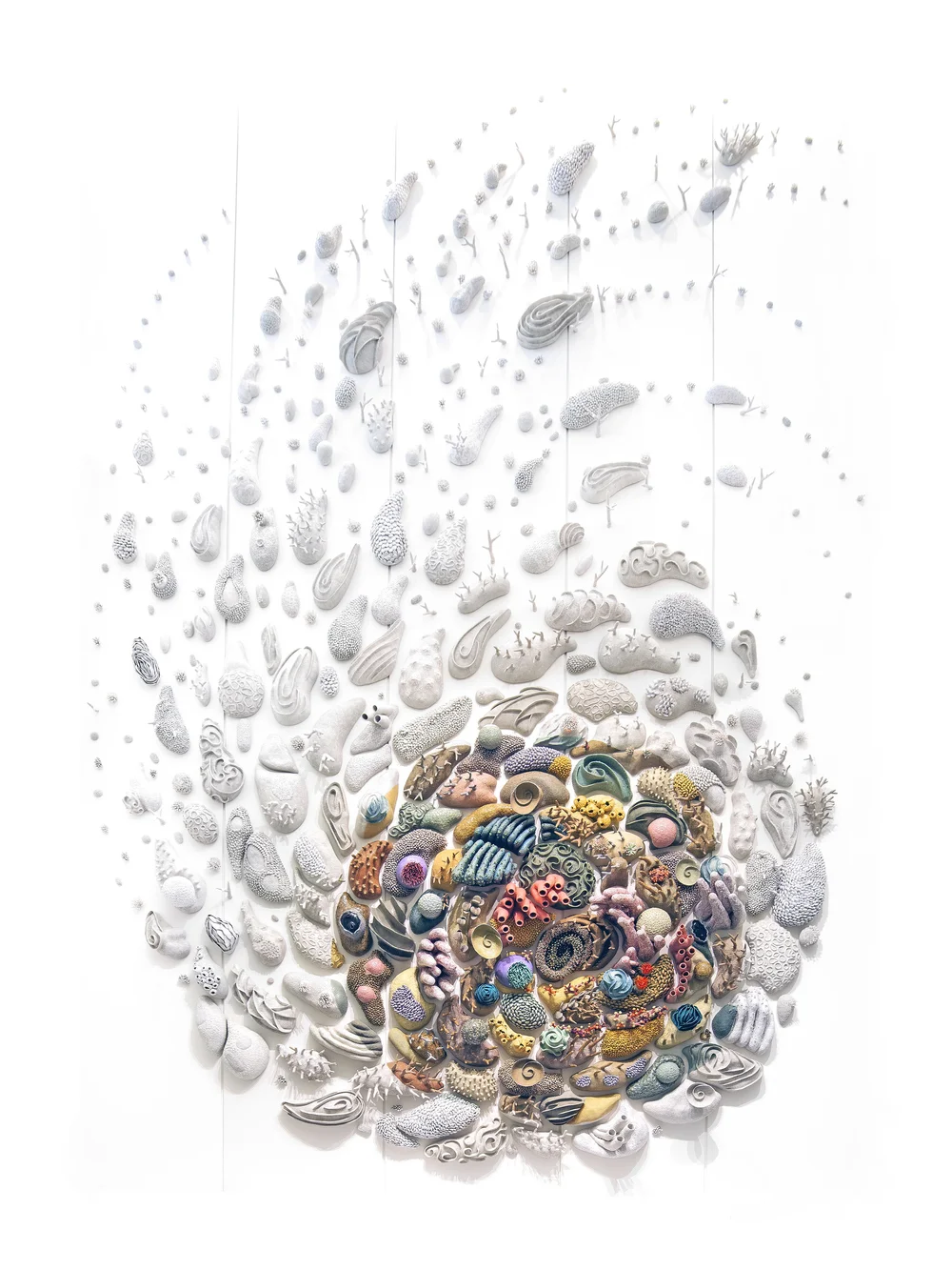
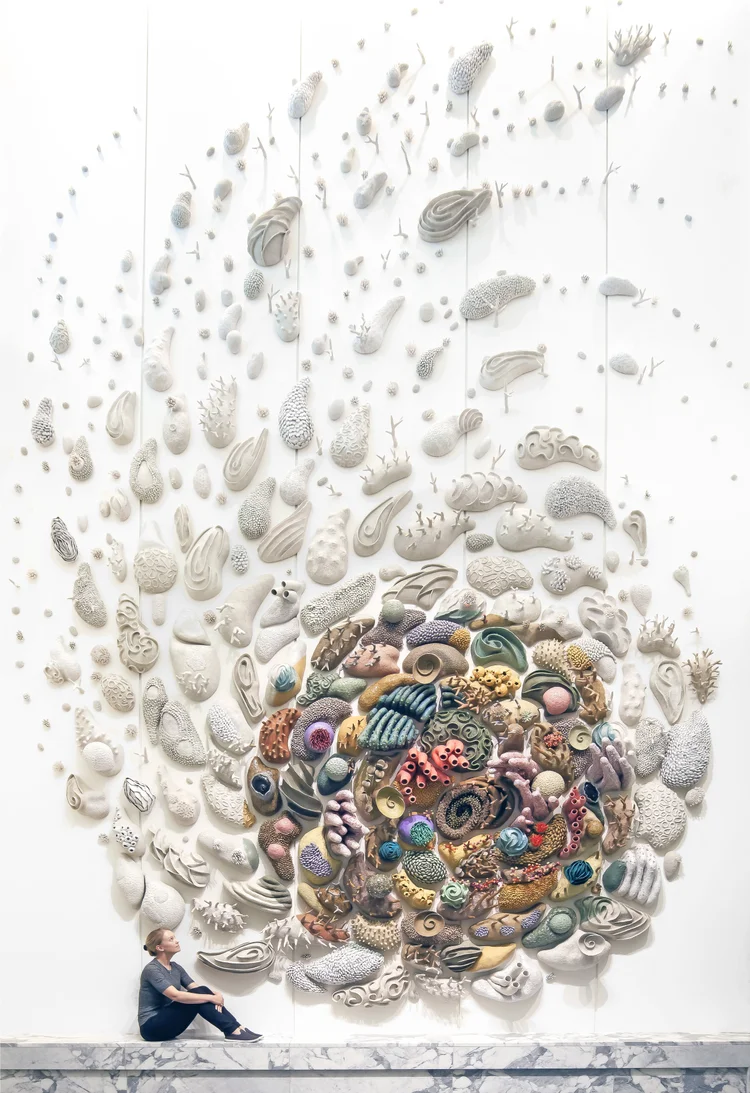
This design work is a sculpture. The sculptures are multiple pieces of hollow ceramic stuck to another medium, which would be a wall, forming a beautiful swirl which forms from the top of the wall. The sizes of the ceramic corals vary from small to big occasionally as the design flows down to the bottom, where the design starts to gain its weight with multiple large pieces of ceramic corals. As for the visual elements of the design, the focus of the design are the colorful ceramic corals that the white corals are swirling into. Overall, it's a simple but beautiful design. (102 words)
Phase 2 - Analysis
This design seems to be symmetrically balanced. Repetition can be seen throughout the whole design, with multiple ceramic corals, big and small, making multiple separate coral-like sculptures to become one design. The white "corals" form a swirl (movement) that leads down to the bottom part of the design, a beautiful and vibrant array of colorful ceramic corals that is the focus point (emphasis) of Confluence. The stark contrast from the bleached corals of the piece and the colored corals is used to differentiate what the piece is referencing to; The colorful living corals and the outer bleached dead corals in the real world. The contrast and the movement of the piece, as well as the colors, managed to make a form of unity within the piece. (126 words)
Phase 3 - Interpretation
 Figure 1.2 | Our Changing Seas III
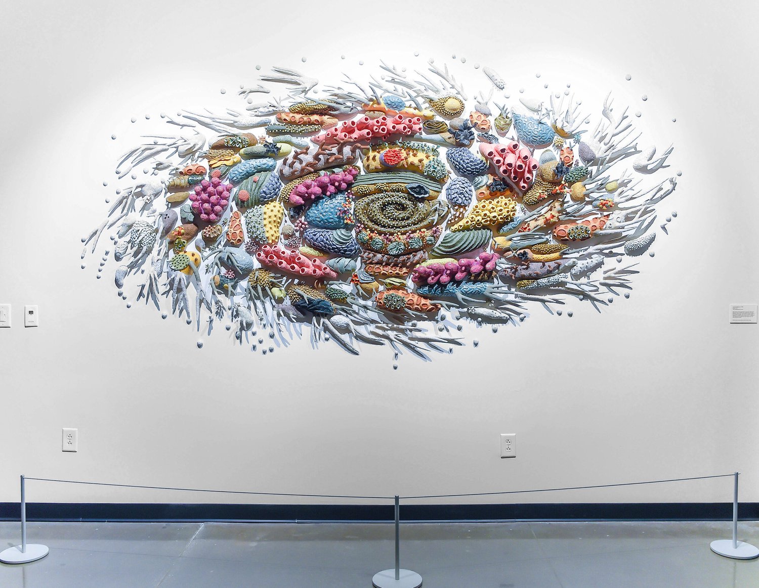
Confluence is a sculpture piece designed to pay homage to Indonesia’s coral reefs and the value they provide to Indonesians and the world that was made in 2017-2018. I find that Courtney Mattison's art are works of Environmental art, or also known as Ecological art. It is an art movement made to draw attention to the world's environmental issues as well as our relationship towards it as people (The Art Story, n.d.), which perfectly encapsulates the reason why the artist has made Confluence in the first place. It is also an interpretation of the Indonesian coral reefs and the affect changes in the environment had on it. (103 words)
Task 3 - Design
09/03/2024 - 22/02/2024 | Week 6 - Week 7
Link to Task 3.
Cycle of Coral

Rationale
The design I made is based on the SDG of Life Below Water (14). In the art I have drawn, there is a coral reef of a multitude of colors with fish thriving around it as it’s surrounded by the ocean’s blue at the bottom of the piece. This is a symbol of the beauty of healthy marine ecosystems that can thrive in the right climate and temperature without any pollution, surrounded by clear and beautiful waters. At the top, the red coral grows out to be a bleached coral surrounded by other corals that are the same, surrounded by darkness. This is an indication of pollution and the death of many coral reefs that it has caused. The living coral reef, once beautiful, will become bleached dead corals if we keep polluting marine life. The main design principles I have used in this design were CONTRAST, where I used the colors in order for them to pop out more with the bleached corals and gray background, as well as the red with the blue background. Next is MOVEMENT where I used the corals to show a motion outward. The last is UNITY with color.
REFLECTION
Coming in, I didn't expect too much from this module other than learning the basics of design which would be able to help me in the future of not only my Bachelor courses, but also my future personal works. I didn't expect it to be quite challenging in its own right, but there was one thing that kept me going and it was my curiosity about design as a whole that this course has instilled in me. I didn't know too much about positive and negative space, different ways of balance, and how some things can still be applied subtly, and how much meaning little artworks have until I came to this module.
I actually enjoyed the process of visual analysis the most, which was surprising considering I love making art by itself. In fact, the part I disliked the most about this was designing the piece itself due to my lack of foresight of how I could use the design I chose, so I will take note of it from now on. I still enjoyed the process but not as much as the previous ones.
I have learned through this module that I actually truly enjoy looking into the meanings behind artwork and the beauty of it the moment I get hooked onto them due to interest. I scrolled through some of Courtney Mattison's works and was inspired by her and the beauty of her work, which made me want to do something similar to her in my spare time. While this didn't really change anything in my learning journey, I managed to develop a better sense of responsibility over my work. I personally think this module is fine as it is currently. I feel that future students would enjoy this module greatly if they are artistic.


Comments
Post a Comment