Advanced Typography | Task 1 / Exercises 1 & 2
Task 1 / Exercises:Typographic Systems & Type & Play
Table of Contents
- Lecture Notes
- Instructions
- Task 1
- Exercise 1 | Typographic Systems
- Exercise 2 | Type & Play Part 1 / Finding Type
- Exercise 2 | Type & Play Part 2 / Type & Image
- Feedback
- Reflection
- Further Reading
1. Lecture Notes
This module introduces and reinforces students to the nomenclature, conventions and practice of Type design and typographic systems for the purpose of exploration and communication through print and screen-based platforms. It seeks to explore the expressive range of typography as a primary visual, illustrative element for use in creative media, and enhance skills for shaping verbal messages through typographic design.
AdTypo 1 | Typographic Systems
8 Major Variations:
- Axial
- Radial
- Dilational
- Random
- Grid
- Modular
- Transitional
- Bilateral
Radial System: All elements are extended from a point of focus.
Dilational System: All elements expand from a central point in a circular fashion.
Random System: Elements appear to have no specific pattern or relationship.
Grid System: A system of vertical and horizontal divisions
Transitional System: An informal system of layered banding.
Modular System: A series of non-objective elements that are constructed as a standardized unit.
Bilateral System: All text is arranged symmetrically on a single axis.
It is important to know that typography not only plays a reading role, but also a visual role.
AdTypo 2 | Typographic Composition
Principles of Design Composition
- Emphasis
- Isolation
- Repetition
- Symmetry & Asymmetry
- Alignment
- Perspective

Emphasis can be in layout and can go through colors.
Rule of Thirds:

Anyone of the intersecting points becomes the focal point of the layout.
Typographic Systems
Out of all 8 systems, the grid system is mostly used which is derived from the grided compositional structure of letterpress. It is also known as the Swiss (Modernist) style typography in modern days.

 Figure 1.3 | Postmodernist System, Week 2 (2/10/24)
Environmental Grid:
 Figure 1.3 | Environmental System, Week 2 (2/10/24)
It is based on exploration of an existing structure or numerous structures combined. An extraction of crucial lines both curved and straight formed. The designer then organizes the information around this super-structure, which includes non-objective elements to create a unique and exciting mixture of texture and visual stimuli.
Form & Movements:

Based on the exploration of an existing Grid Systems. The placement of a form on a page, over many pages creates movement. The forms could represent images, text or colour.
AdTypo 3 | Context & Creativity
Handwriting:
First mechanically produced letterforms were designed to directly imitate handwriting. The shape and line of hand-drawn letterforms are influenced by the tools and materials used to make them.

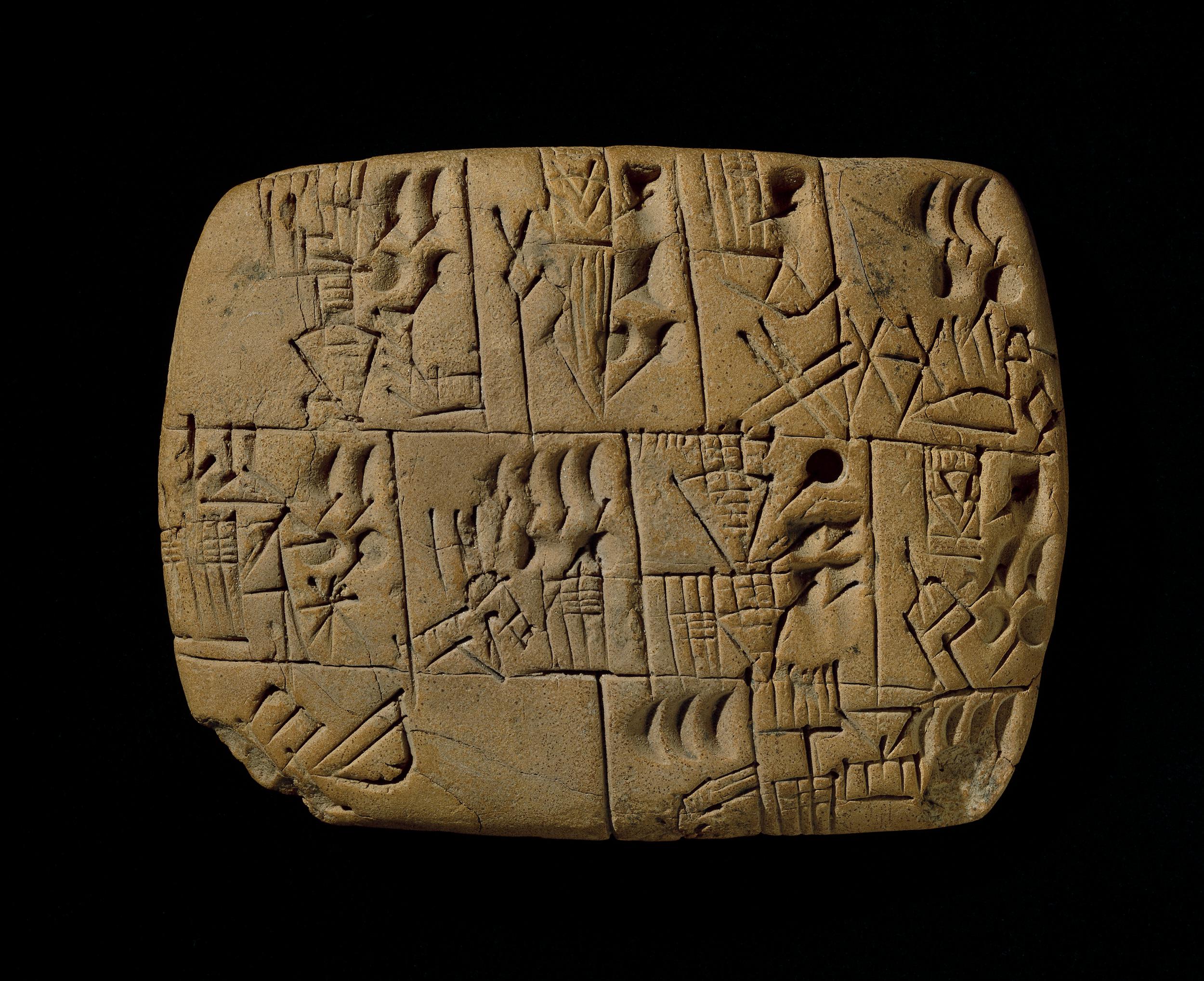
The earliest system of actual writing, written from left to right and evolved from pictograms.

Ideograms, represent the things they actually depict. As determinatives to show that the signs preceding are meant as phonograms and to indicate the general idea of the word. As phonograms to represent sounds that "spell out" individual words.
Early greek (5th C. B.C.E.): Drawn freehand, not constructed with compasses and rules, and they had no serifs. In time the strokes of these letters grew thicker, the aperture lessened, and serifs appeared.
Roman Uncials: By the 4th century Roman letters were becoming more rounded, the curved form allowed for fewer strokes and could be written faster.
English Half Uncials (8th C.): In England, the uncial evolved into a more slanted and condensed form.
Carolingian Minuscule: Capitals at the start of a sentence, spaces between words and punctuation. It was this style that became the pattern for the Humanistic writing of the fifteenth century; this latter, in turn, was the basis of our lower-case roman type.
Black Letter (12-15 C. CE): Characterised by tight spacing and condensed lettering. Evenly spaced verticals dominated the letterform. Condensing line spacing and letter spacing reduced the amount of costly materials in book production.
The Italian Renaissance: Newly rediscovered letterforms Antica. The renaissance analysis of form that was being applied to art and architecture was directed toward letterform — resulting in a more perfect or rationalised letter.

The oldest writing found in the ‘Indian’ subcontinent the Indus Valley Civilization (IVC) script (3500-2000 BCE), is as yet undeciphered and seems to have been somewhat logo-syllabic in nature.
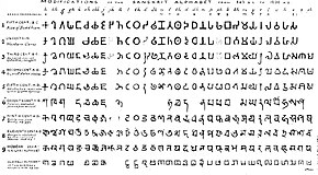
The earliest writing system developed in India after the Indus script. It is one of the most influential writing systems; all modern Indian scripts and several hundred scripts found in Southeast and East Asia are derived from Brahmi.
AdTypo 4 | Designing Type
The general process of Type Design:
1. Research
- When creating type, we should understand type history, type anatomy and type conventions. We also should know terminologies, side bearing, metrics, hinting, etc.
- Important to determine the purpose of the type and what it would be used for.
- Also recommended to examine existing fonts that are being presently used for inspiration/reference/context/etc.
- Some designers sketch their typeface using the traditional tool set (brush/ink/paper) then scan them for the purpose of digitization.
- Some use digital tool sets such as Wacom directly into a font design software (much quicker, persistent, and consistent) but it can impede on the natural movement of hand strokes.
- Leading font software are: FontLab and GLyphs App.
- Attention should not only be given to the whole form at this stage but also the counter form. The readability of the text is highly dependent on it.
- Results of testing is part of the process of refining and correcting aspects of this typeface.
- Prototyping is also part of the testing process and leads to feedback.
- The task of revision doesn't end on deployment due to unforeseen errors that didn't come to fore before.
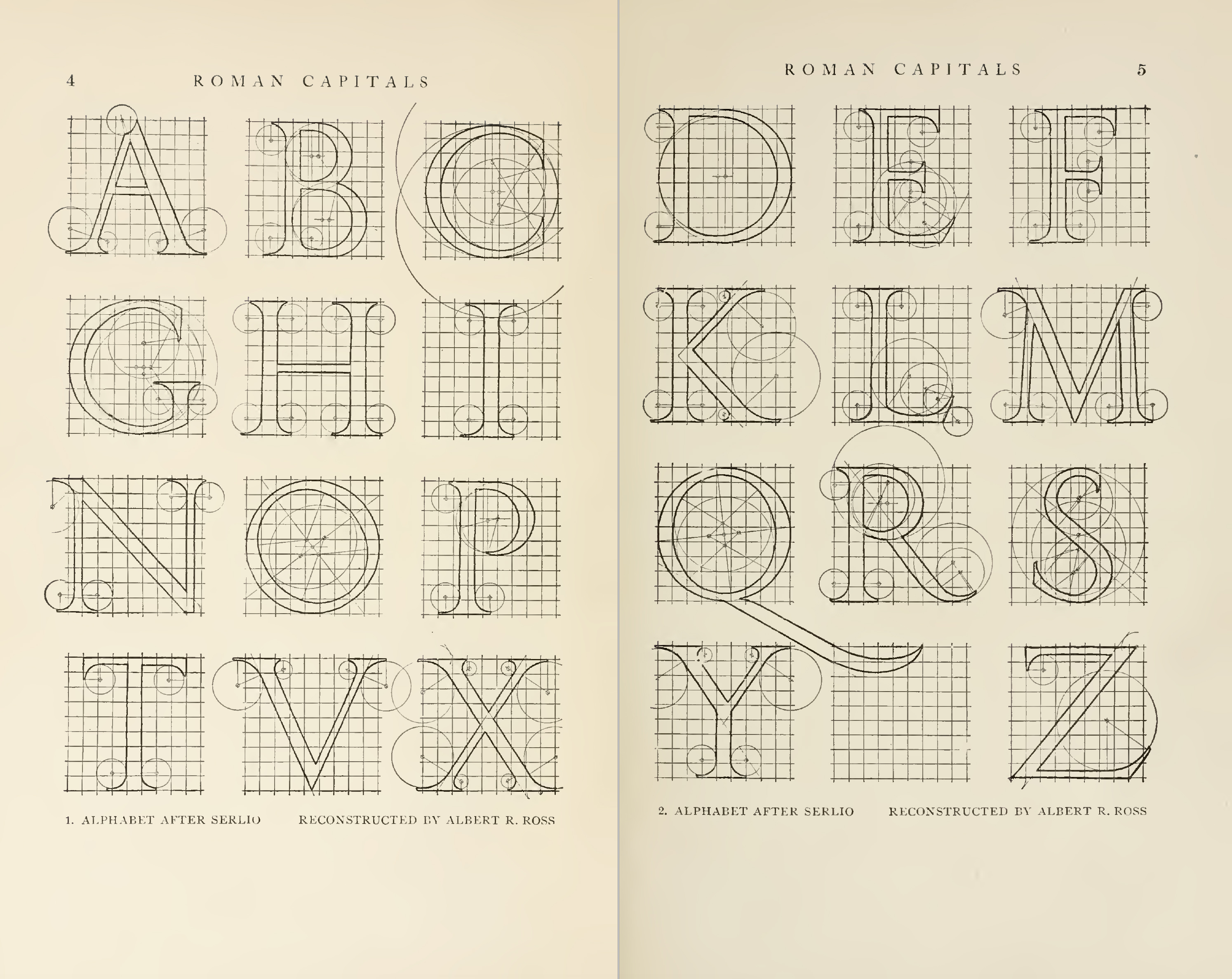 Figure 1.9 | Construction Grid for Roman Capital Letters , Week 4 (17/10/24)
2. Instructions
3. Task 1
Exercise 1 | Typographic Systems
For this exercise, we are to explore 8 systems which are Axial, Radial, Dilatational, Random, Grid, Modular, Transitional and Bilateral in InDesign using the content given in the MIB. I decided to go with "The ABCs of Bauhaus Design Theory."
Important Notes:
- Size 200 x 200 mm
- Colours: Black and additional colour
- Minor graphical elements
Axial System.

At first glance, I thought the Axial System would be simple to understand to do and understand but I severely underestimated how much time something this simple took me. It was difficult to find the right places to place the type in and also where to add detail. It was difficult to make enough of a balance for it to even look presentable.

For the next attempt, I tried another take on the Axial System where it's slanted and focused on the majorly on the right side the design.

After receiving Mr. Vinod's feed back to move it more towards the right, I moved the most top information in accordance to it as well as removing the dot and adding a square instead to give more of a feel of symmetry. I added some lines at the side of the words at bottom to give a more professional feel to it.
Radial System.

This was my first attempt at the radial system before fully understanding it. I used one circle to pivot and spread out the information to one side in order to make it seem as if it were pers of a bigger circle. However, after looking at it for awhile, I decided that I should approach other ways to make the Radial system more readable and easier to look at.

I decided that this time, I would use two circles to pivot and spread out the information equally so that the words had more space rather than to simply stack them on one side. I was more satisfied with this one, but I felt as though I could do better without the big circle at the right corner.

I put the bigger circle at the top left corner in order to draw attention to the title of and made a smaller little circle in order for viewers to still be able to locate where the other part of the information would be easier than having no circle.
Dilatational System.

For the Dilatational System, I decided to make the title of the lecture's text bigger than the rest of the of the other circles and made it seem as though it was leading downward from the "Open Public Lecture" to the the dares and times of the lectures as well as the lecturers.
Random System.

The Random System was very confusing for me to work on due to all the examples I have seen being nearly incomprehensible. I decided to go with another type of random that is still slightly comprehensible but uses different fonts and added black squares to make the design pop out more.
Grid System.

The Grid System was slightly difficult for me to figure out but I followed the grids as best as I could and made a design where the lines can help direct the attention of the viewer to the title of the lecture as well as still presenting the dates. I used a 6x5 squares for this design.

For this design, I decided to rearrange the elements of the previous design as well as invert some of the colors in order to make the words pop out more than in the previous version. I used a 3x3 square design for this.
Transitional System.

For this design, I wanted to make it have a sort of a rhythm of moving down the same path parallel to each other and making sure it flowed.
Modular System.

For the modular system, I tried my best to fit the columns and guides placed and make sure the words were fit in a neat order without clashing with the other parts.

For this design, I decided to invert the black and white and use a colored outline for the numbers to make it more soothing to the eye.
Bilateral System.

The Bilateral System Designs were the easiest for me to complete out of all of the designs here. For this design, I decided to focus on the center and make the words white and background black in order to make the design pop out more. I added a circle to draw your attention the center, with the above being the title.

I made another design where the majority of the focus is on the left while the other information is on the other side.
Final Task 1 | Exercise 1


Exercise 2 | Type & Play Part 1 / Finding Type
For Exercise 2, we were instructed to analyse, dissect and identify potential letterforms within the dissected image. The forms would be explored and ultimately digitized.
Finding an Image

We were instructed to find an image where we could get letterforms out from. I decided to choose a photograph of a brain coral due to it's many nooks and crannies that look like unique shapes.
Extraction
Originally, I extracted these 5 letters from the smaller spaces of the brain coral.

After receiving feedback from Mr. Vinod that I should instead encapsulate more areas of the coral instead of the smaller parts, I decided to follow his advice and extract another 5 letters from bigger chunks of the coral.

Refinement Process

For the Font Reference, I chose to use the Futura Std Light Condensed font since it was the most similar in length as the extractions. It was also simple and easy to read so I decided that I should refine my extraction in this.

First, I decided to align the extractions to the font reference so that it'd be easier for me to adjust and work on it as seen by the top right corner of Figure 4.4. I then removed the holes in the extraction and adjusted it to fit the reference font while also keeping the uniqueness of the corals. I then added the maze like holes back into the the adjusted extraction to keep the original look of the extraction.
After getting approval from Mr. Vinod, I decided to add the last refinements in by adjusting the size and length of the extraction and I was done.
Final Part 1 | Finding Type


Exercise 2 | Part 2 / Type & Play
For Part 2, we were instructed us to create a movie poster using the letterform made during Part 1.
Since my letterform is of a brain coral, I looked for images concerning corals and the sea for my movie poster. I have went through multiple images of the coral reefs in the Great Barrier Reef to see which would fit more.

In the end, I chose a image of a pile of dead corals to go for a horror feel for the movie poster.

I put the image into Photoshop in order to adjust the colors and contrast of everything inside it, as well as adjusting brightness and more.

Afterwards, I decided to make some drafts after observing some Movie Posters that have come out in recent years.

I decided to go with the left most draft due to it being easier to look at as well as being able to see more of the image than the right.

I adjusted XBNAU to be bigger to fit the image more and be more impactful. I also made some adjustments to the words, thinking it would make the poster look better overall.

I decided to use clipping mask and pen tool to cover up parts of the title to make it feel as though it was part of the image itself, like it was something seen in the distance.

I also decided to make the words gradient in order to make it blend more into the background a little more and give more of a sense of a horror movie, like it was part of the dark ocean in the back.

Mr. Vinod gave me feedback on the fonts I used below being not fit for a movie poster so I decided to change the font to Futura Std. Light in order to make it both more professional but also to make it feel balanced. I also rearranged the phrase of the movie to be above the "Coming Soon" after observing some other movie posters does so.

I also saw that the production team and credits of the teams were usually placed upwards in posters and so I decided to go for that as well after changing the font to Futura Std. Light while varying the shapes as to keep the name the main focus of the credits.

Afterwards, I noticed that XBNAU didn't exactly align perfectly center in the poster and adjusted the spacing and words of it as to make it as centered as I could.

After all that, I made a simple logo that would serve as the "company" of the fake movie that I have created and placed it at the bottom. With that, I was done.
Final Part 2 | Type & Play

Figure 4.12 | Final Poster (PDF), Week 4 (15/10/24)
4. Feedback
Week 2
General Feedback:
- Axial needs to be adjusted. Radial and Dilatational is okay.
Specific Feedback:
- Move the Axial Design more to the right.
General Feedback:
- Make 5 letterforms for Part 2.
Specific Feedback:
- Instead of doing the small holes, use the bigger parts to get a maze like feel for it.
- Looks okay after extraction
- Remember to use the path tool
General Feedback:
- Briefing on Project 2.
- Make sure to include Baseline version of Exercise 1.
Specific Feedback:
- Rearrange some parts of the poster.
- Switch fonts of some parts.
- Remember to include the logo.
5. Reflection
Experience
Completing Exercise 1 & 2 was incredibly challenging for me in this short span of time. Even though it was incredibly challenging, I enjoyed exploring and learning about how to do the different 8 systems as well as extracting letterforms from existing objects. I have to say that what I have made for the assignment could be improved with more time but I am quite satisfied with how they turned out in this short span of time. Exercise 2 was the most fun out of all of the parts of the assignment, being able to test my imagination and design sense in the poster. I'm nervous for future assignments but I'll continue doing my best.
Observations
I found that reading up on the systems and seeing examples helped really clear up what I should do in Exercise 1 and the feedback for Exercise 2 helped me greatly on making a better letterform than the one I initially made.
Findings
I have been able to find how to make letterforms from images and finding type within images. My view of typography was quite limited to the previous semester, but this expanded it a little more.
6. Further Reading

For this task's further reading, I decided to read this book. It was recommended to us by Mr. Vinod for Exercise 1 of this task.


Comments
Post a Comment